Bex Chamberlain Photography
A full technical and UX audit uncovering performance gaps, navigation, and missed conversion opportunities across a photography portfolio website.
Client - Bex Chamberlain Photography
URL - bexchamberlainphotography.co.uk
Focus - Performance, SEO & UX
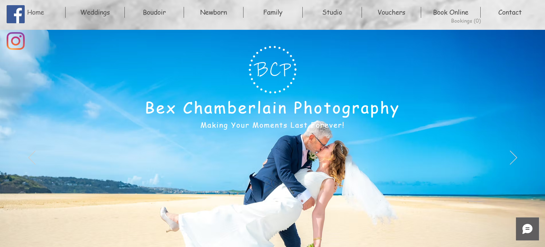
A picture of Bex Chamberlain Photography homepage on their website
Overview: A strong foundation, held back by refinement
Bex Chamberlain Photography has built a website with solid foundations, a perfect SEO score on both desktop and mobile, strong accessibility ratings, and genuinely beautiful photography. But beneath those headline numbers, a closer look reveals a gap between what the website could be and what it currently delivers.
The audit focused on three interconnected areas: technical performance (particularly on mobile), navigation, and the user experience. The findings show a consistent theme: the material is excellent, but the presentation and structure are working against it.
Technical Audit: Performance: desktop is solid, mobile needs attention
The most significant technical finding is the 21-point gap between desktop and mobile performance scores. An 89 on desktop is respectable, but a 68 on mobile hurts the user experience, and with a photography audience increasingly browsing on phones.
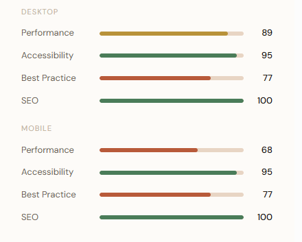
Chart showing the Google Lighthouse results.
What's causing the mobile performance dip?
The audit flagged two key technical bottlenecks affecting the initial page load on mobile:
! Server response & network request latency
The first network request, the most critical, is being slowed by unnecessary redirects, suboptimal server response times, and a lack of text compression. On slower mobile connections, this creates a noticeable delay before anything on screen begins to load.
↓ Image download time impacting LCP
Largest Contentful Paint (LCP): The time it takes for the main visible image to load is being dragged down by unoptimised image delivery. For a photography website where images are the primary content, this is a high-priority fix.
UX Audit: Navigation, hierarchy & the missing call to action
While the technical scores tell one story, the user experience audit tells another. Visitors can reach the website quickly, but once they're there, the journey to becoming a client is less clear than it should be. Four recurring issues came up across every page reviewed.
1 No clear page hierarchy or visual structure
Pages lack consistent heading structure and section dividers, making it hard for visitors to scan and understand content at a glance. Information blends without clear signposting. This is hard for the customer to understand what the photographer is offering.
2 Insufficient contrast and legibility
Text contrast is low in several areas, notably on the homepage and wedding package headers, making content harder to read, especially in bright conditions on mobile screens.
3 Inconsistent branding and layout
Design inconsistencies across pages in spacing, font treatment, and content layout give the site a fragmented feel. Cohesive branding builds trust, particularly for a premium photography service.
4 Navigation is overloaded
The main navigation contains too many items, including social media buttons that overlap on the nav bar. This clutters the header and makes it harder for users to identify the most important actions. By refining the navigation bar, it will help the customer find what they are looking for faster.
Recommendations: Priority actions to improve performance & conversions
Based on the audit findings, here are the recommended next steps, organised by priority. Quick wins can be implemented immediately and will have a visible impact on user experience.
High
Optimise images for mobile: Compress and serve appropriately sized images to reduce LCP on mobile. This is the single biggest lever for improving the mobile performance score from 68.
High
Add a clear call to action on the homepage: Add a prominent "Book Online" button below the slideshow. This is the most direct conversion improvement available and costs very little effort to implement.
High
Condense and reorganise the navigation: Reduce nav to: Home, Weddings, Studio, Vouchers, Contact, Book Online. Move Boudoir, Newborn, and Family under a "Studio" dropdown. Remove social icons from the navigation bar and place in footer.
Medium
Fix text contrast & improve readability: Change body copy to black on pages where it's currently pale or hard to read. Add dividers between content sections on the wedding page and other content-heavy pages.
Medium
Fix the homepage slideshow loop: Ensure the slideshow transitions continuously without glitching. A broken animation on the homepage creates an immediately poor first impression.
Medium
Add reviews to the homepage: Social proof is a key trust signal for booking decisions. Adding a reviews section or widget to the homepage can directly influence enquiry rates.
Growth
Start a blog to strengthen SEO over time: The site already scores 100 for SEO technically — blogging is the next layer. Regular posts (behind-the-scenes, location guides, client stories) will drive organic traffic and long-tail search visibility.
Growth
Add an FAQ page: An FAQ covering the most common client questions reduces friction before enquiry and also contributes to SEO through structured content.
Growth
Explore subtle animations for polish: Tasteful fade-in and scroll-triggered animations can elevate the premium feel of the website without affecting performance when implemented correctly.
Conclusion - Great foundations. Clear path forward.
Bex Chamberlain Photography's website is already in a strong position — the SEO score is perfect, accessibility is excellent, and the photography content itself is the kind that wins clients. What this audit reveals is a set of well-defined, actionable improvements that, taken together, would meaningfully close the gap between how good the site looks and how effectively it converts visitors into bookings.
The priority is mobile performance and conversion clarity. Fix the image loading, add the call to action, tighten the navigation — and the site immediately becomes a more effective business tool. Everything else builds on that foundation.
“James and Sophie did a full audit of my photography website and I cannot recommend them enough!
The detail in the report they provided is so insightful and well laid out. During the follow up meeting they explained everything in depth and offered advice for areas of improvement too.
if you are in need of assistance with your website, these are this is the team for you!”